
HealthStream is a healthcare technology company focused on strengthening the clinical workforce through solutions for learning, credentialing, and operations used by hospitals nationwide. As part of its ecosystem, HealthStream is the home of NurseGrid, the #1 nurse scheduling app in the United States, trusted by nurses to manage shifts, swaps, and day-to-day scheduling.

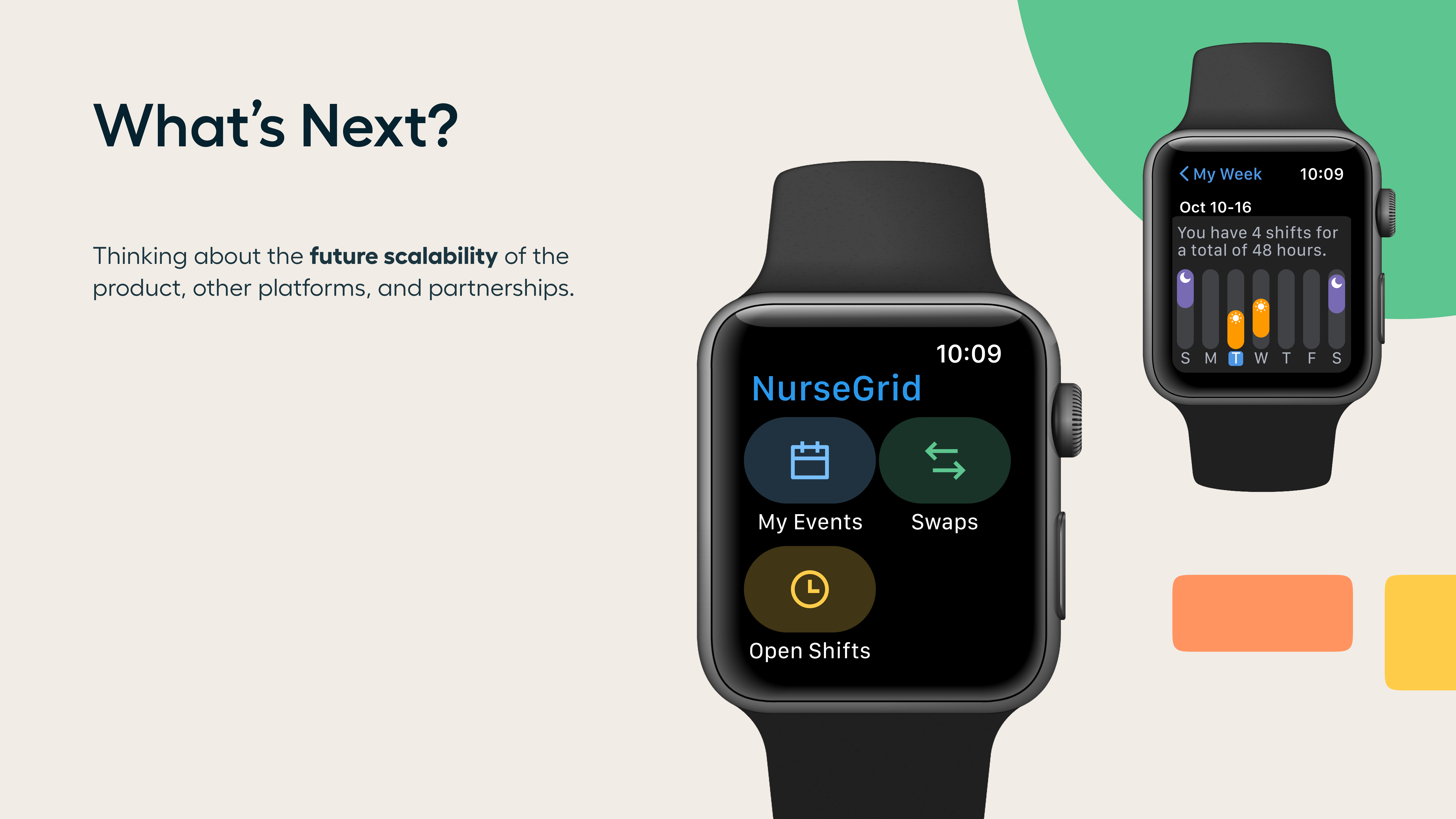
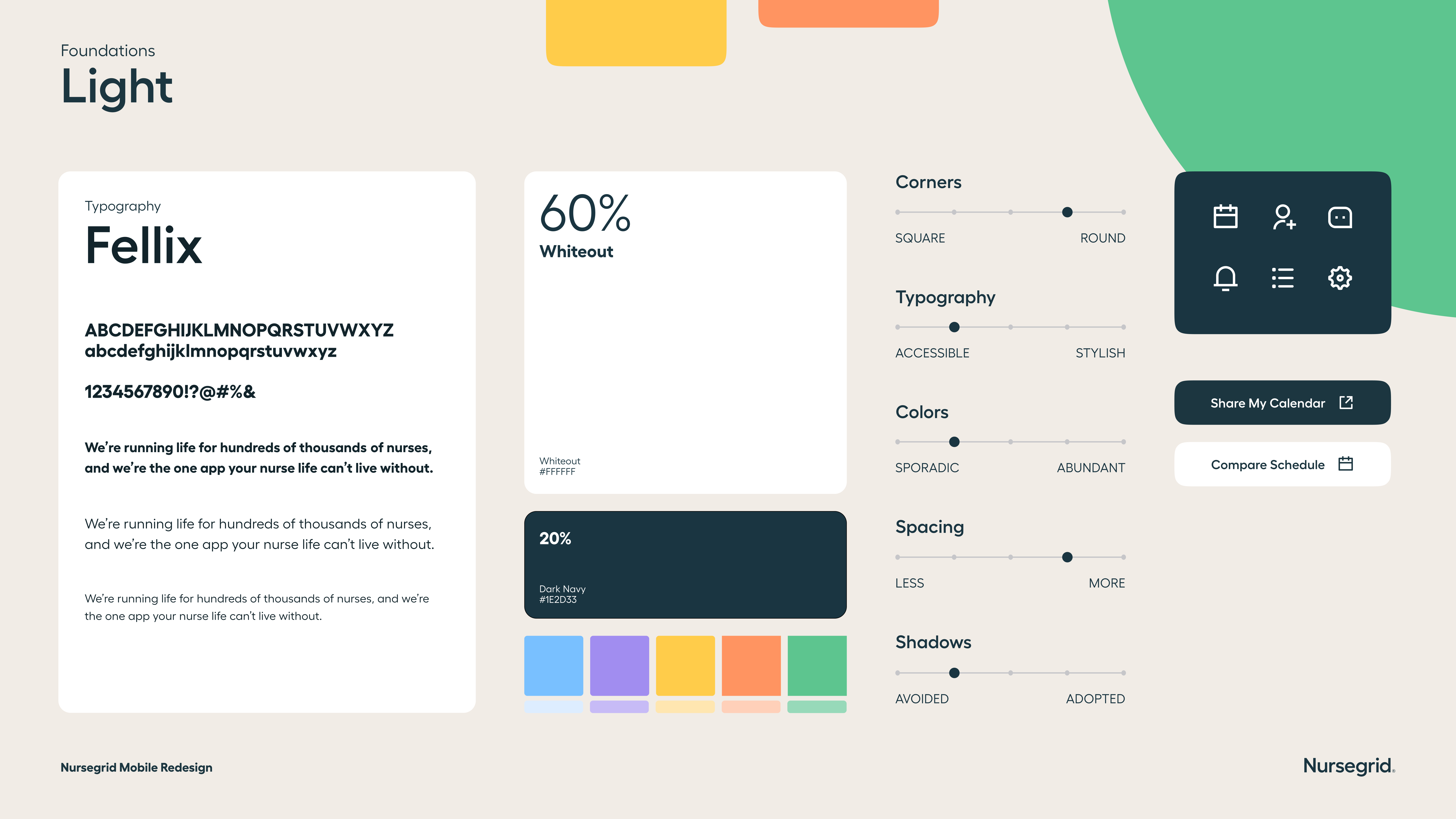
The project focused on modernizing the visual identity, improving functionality and usability across mobile and web, and creating a cohesive design system that could scale across both products. The work balanced the needs of clinical staff managing complex schedules with the operational requirements across multiple healthcare organizations, while positioning NurseGrid for long-term growth within HealthStream’s product ecosystem.

2 UI/UX Designers
Product Design
UI/UX Design
Healthcare Technology
Design Systems
Mobile & Web
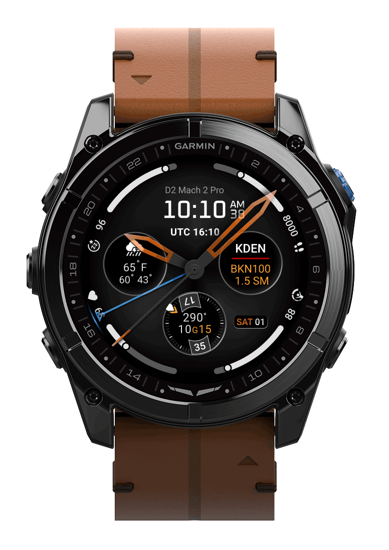
The hero watchface direction began with a broad cross-functional concept phase. Initial design esign explorations were submitted by contributors across Outdoor, Human Factors, Software, and additional teams—bringing diverse perspectives to the table.
✦ Hosted an open review session, collecting structured feedback and votes from key stakeholders across disciplines.
✦ Identified a clear directional preference around a radial, instrumentation-forward layout.
✦ Transitioned from exploratory concepts into production-ready mockups.
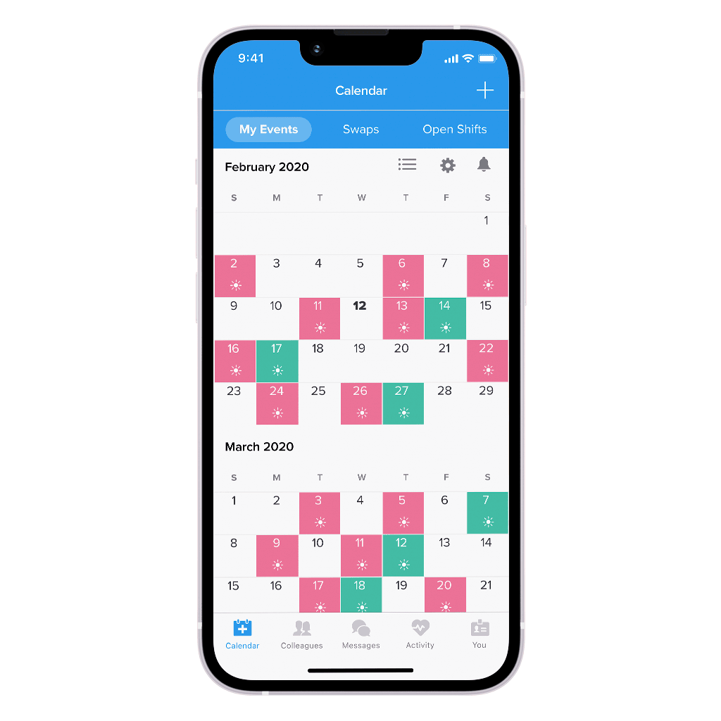
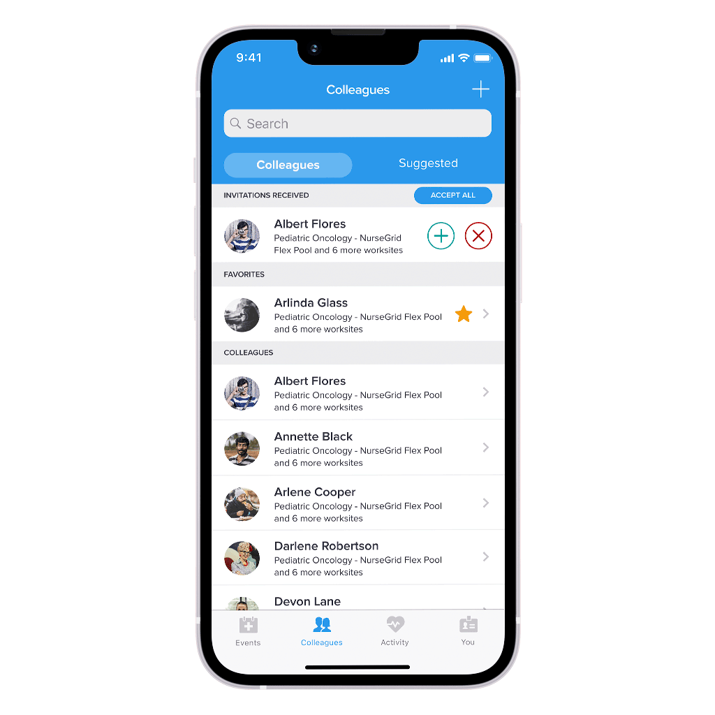

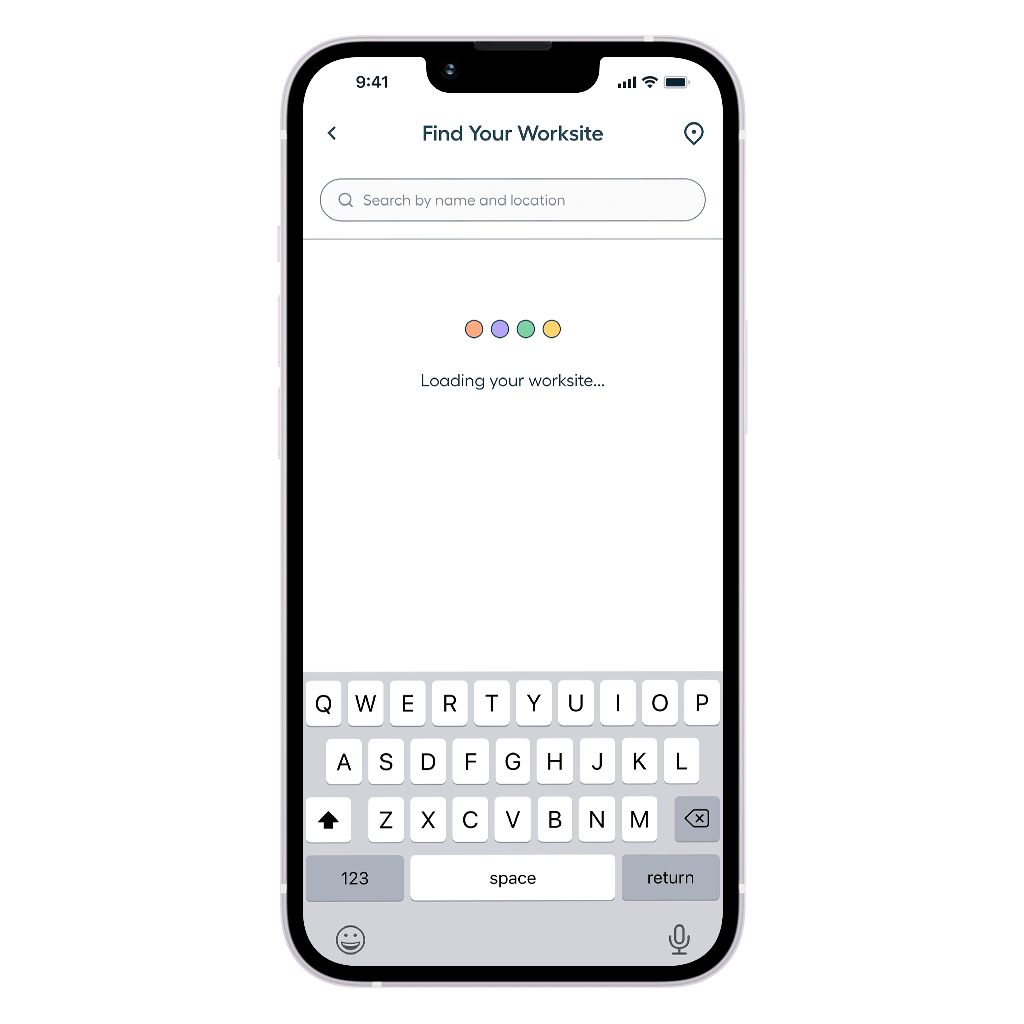
I picked the Calendar and Colleagues screens as visual reference for concepting. By doing so, we gathered a few insights:
⚠️ Lack of shadows led to a flat appearance, making it difficult to highlight tactile areas.
⚠️ Usage of lines led to blocky feel that doesn’t match the current mobile design trends.
⚠️ The current typeface is not accessible on smaller screens.
✅ Color palette is diverse and allows to play with contrasts.
✅ The typeface “Fellix” works well on mobile screens.
✅ Graphics serve as a foundation to define an iconography style.
Detailed specifications were developed to translate the design into a production-ready implementation, ensuring consistency across edge cases, lighting conditions, and real-world usage scenarios.
Three key refinements were introduced to improve data clarity, reinforce visual hierarchy, and support precise developer handoff:
✦ A restructured Data Hierarchy that prioritized critical flight information, reduced visual noise, and ensured key metrics could be quickly interpreted at a glance.
✦ Refined Aviation Data Treatments that standardized how conditions, location, and environmental data were displayed, improving consistency and readability across varying states.
✦ Precise Watch Hand Specifications that defined geometry, motion, and layering behavior, enabling accurate implementation while maintaining clarity across all time states.
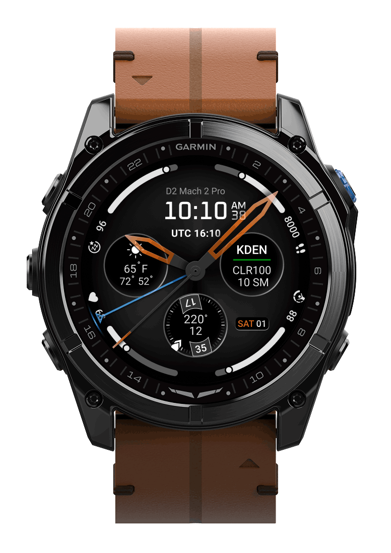
Key scenarios were explored to validate how the interface performs when displaying maximum data, shifting priorities, and reduced system resources.
Each state was considered as part of a cohesive system rather than a single static layout.
Three key scenario explorations were used to ensure clarity, flexibility, and reliability across use cases:
✦ High-Density Data States that integrate pilot-defined personal minimums alongside real-time metrics, reinforcing safety awareness while ensuring all information scales clearly without compromising hierarchy or legibility.
✦ Low Power Mode adaptations that reduce visual complexity while preserving essential information, ensuring continued usability during constrained system conditions.
✦ Flight Condition States that dynamically communicate VFR, MVFR, IFR, and LIFR conditions through consistent visual treatments, enabling quick recognition and informed decision-making at a glance.
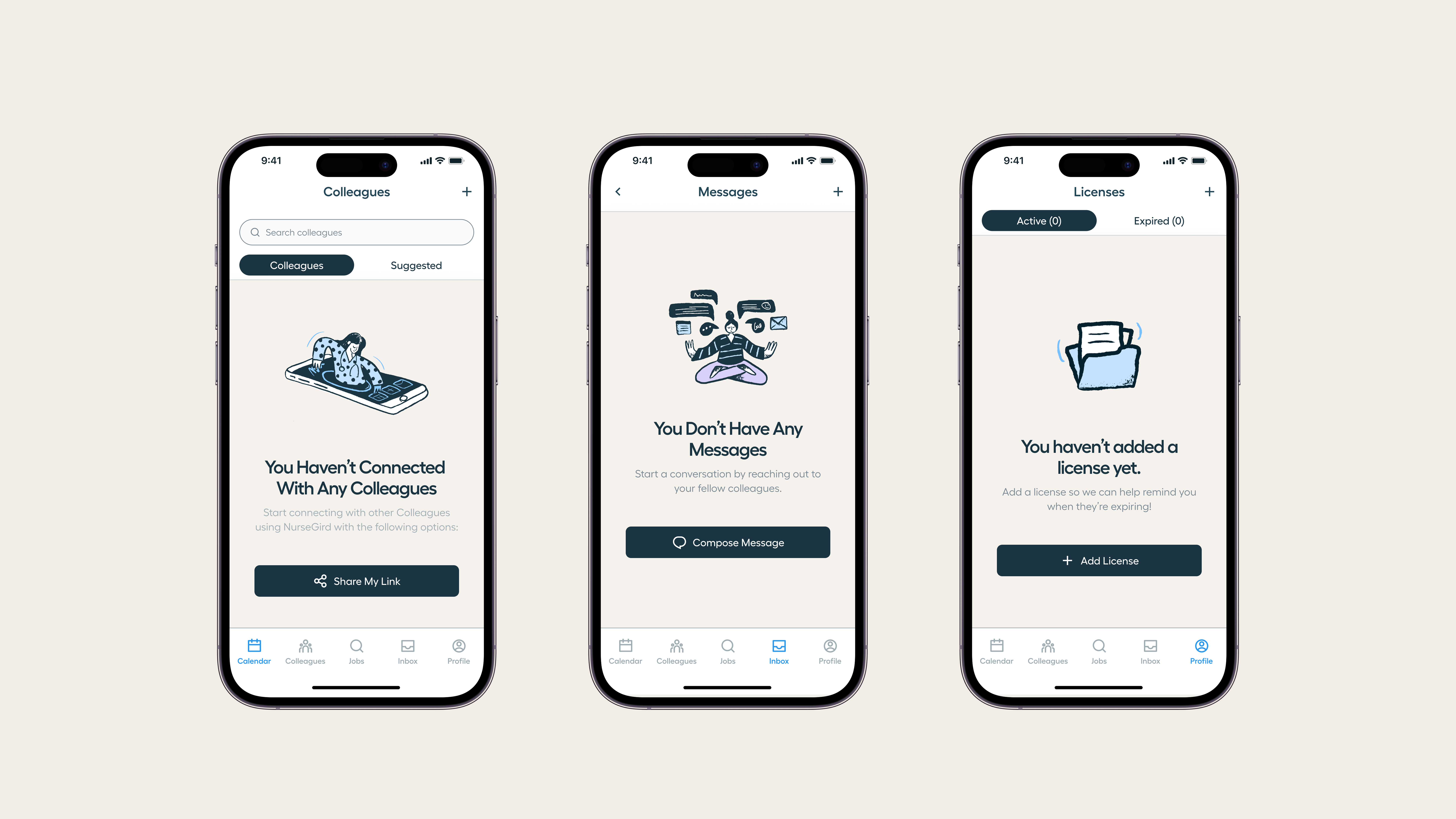
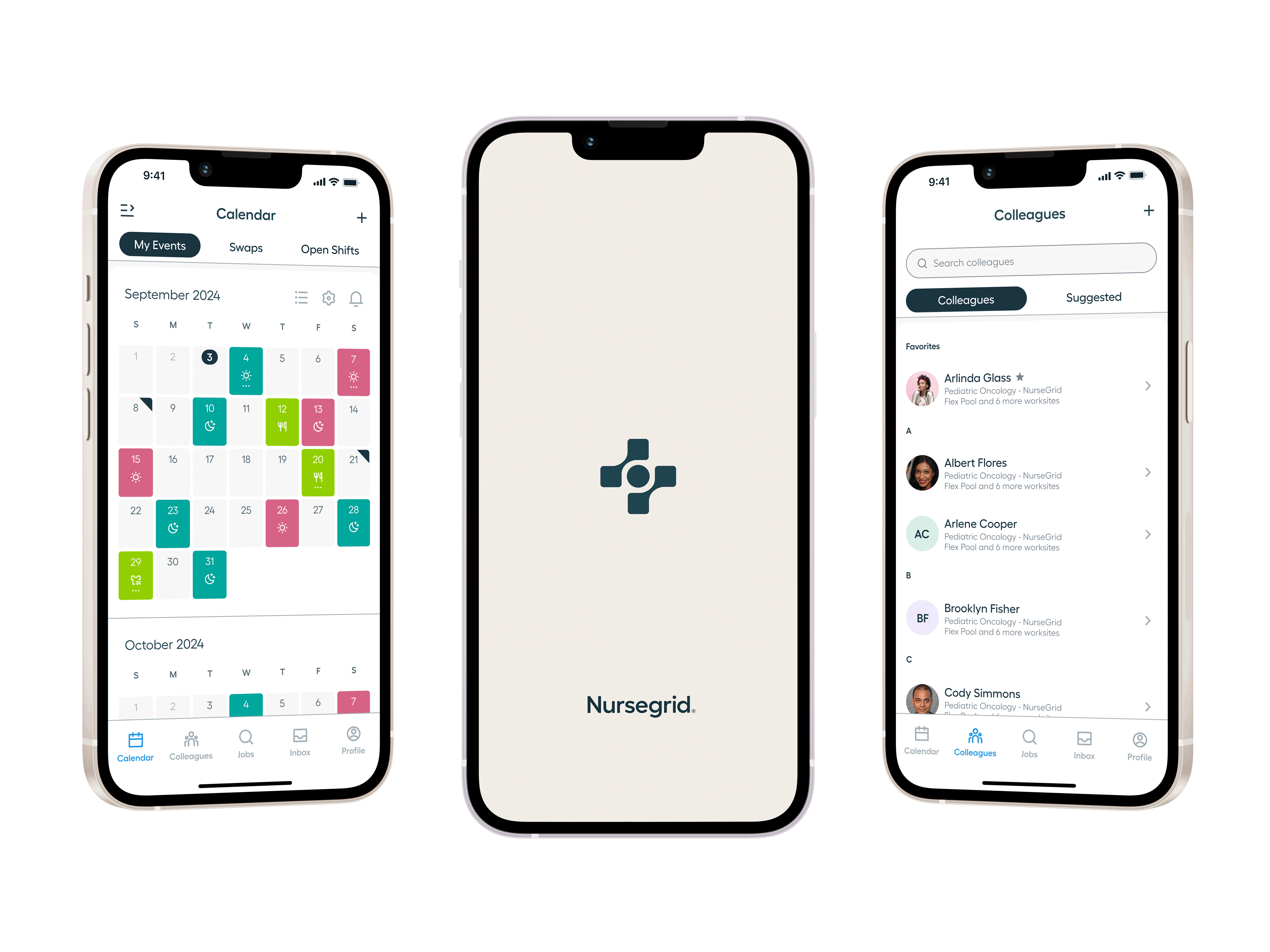
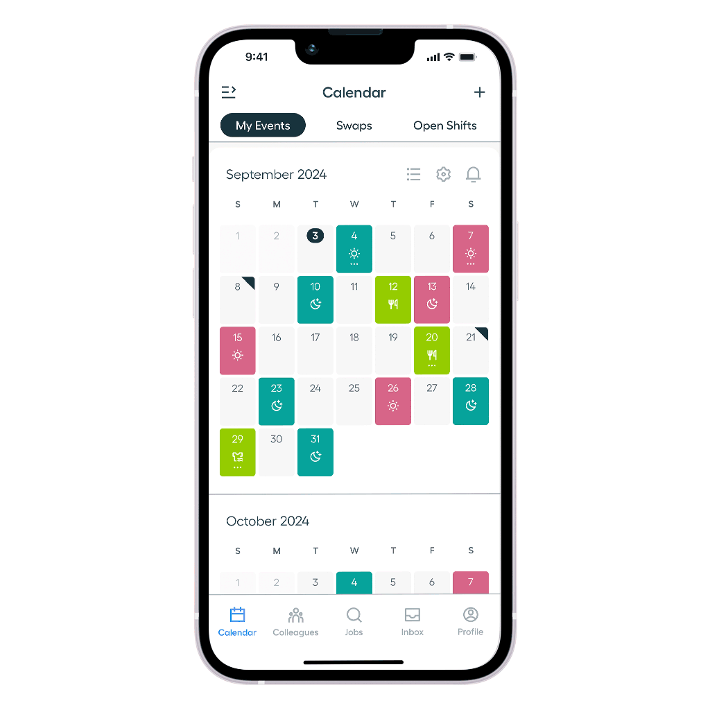
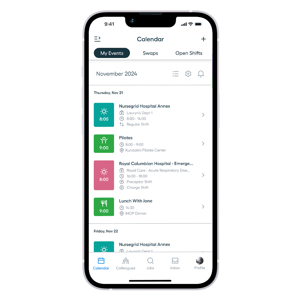
A comprehensive rebrand was implemented across NurseGrid and the web app NurseGrid Manager, translating the updated visual identity into a scalable, production-ready design system.
Core components and variable styles were built to align with the new typography, color system, and accessibility standards while maintaining platform-specific conventions across mobile and web.
Three key enhancements were introduced to modernize navigation, strengthen scheduling workflows, and reinforce the refreshed visual language:
✦ A new Sidebar Navigation system that improved information architecture, streamlined access to key tools, and created a more cohesive cross-platform experience.
✦ Enhanced Scheduling Management Views with clearer hierarchy, improved interaction patterns, and better visibility into shift coverage, swaps, and credentials.
✦ A distinctive Loading Animation that introduced personality into transitional states while reinforcing the updated visual identity.
The new branding encompasses a renovated look that instills more energy and clarity in the brand; while harkening back to retro ties and continuing to feature orange as their key brand color.


This branding is used throughout a fresh and snappy mobile experience. It’s now easier than ever to purchase, pre-order, and listen to your vinyl collection – both at home or on the go.
✦ A new Onboarding userflow allows users to easily log into their Guestroom Records account using your email address, Face ID, or register as a new user to create a brand new account.
✦ These days vinyls come with digital track download codes. Using Guestroom Records makes this a breeze. Upon purchase of a vinyl it will also be added to your Digital Library so you can still listen to your favorite song even when you’re away from your turntable.
✦ The Traditional Shopping Experience featuring a storefront with vinyls that are all neatly displayed, visible, and searchable.
✦ The Personalized Feed Experience that features your most highly recommended albums grouped into a for you page. The user is able to swipe through using multiple gestures to preview, save, or remove vinyls to their liking.
Twenty insects from Oklahoma were chosen and adapted into an illustrated symbol system to be housed within the interfaces.

The insect symbol system and mobile app interface are the beginning of bringing an educational and nurturing experience to the OKC Zoo both up close and from afar.
✦ An Onboarding Tutorial was developed to guide users, as well as, link to the app store to allow the app to be accessible on mobile devices directly from digital QR exhibit posters.
✦ Insect descriptions will serve to inform the audience and streamline the exhibit experience, while a Insect-Tracking Camera feature allows the zoo guests to document and share their journey.
✦ A Digital Map provides a simple solution to a complex area. Exhibits are divided and can be expanded for more information.
The new report features colors, images, and references from multiple Nintendo games. Products are shown in use providing imagery of the company’s missions and values. Information was maintained while being visualized in a simple and fun presentation.


An illustrated console timeline shows the evolution of entertainment systems throughout the decades. More colors, imagery, references from Nintendo’s video games, and corporate historical context have been added.
Prominent graphs and charts were adapted to streamline complex data into simple and branded graphics.


Mindful.Me is an app dedicated to the recovery and restoration of one’s mental health. It provides a reliable and accessible solution to finding mental health professionals and self expression.
✦ The Mindful.Me Logo is made up of multiple pieces that come together to become whole. It is an abstraction of a group therapy session and meant to evoke the idea of community.
✦ The App Icon functions as the entry point for users while being a memorable and distinct mark when surrounded by other apps.
✦ A splash screen Digital Illustration was created to serve as a visual conveying the ambience of the service to consumers.


An interactive prototype was built to demonstrate the navigation through the mobile app. In addition, three key new features were introduced to boost user engagement and partner product visibility:
✦ The Doctor Portal onboards patients and connects users to local or virtual therapists to find, meet, and chat.
✦ An Appointment Calendar aid users in maintaining a consistent schedule with their therapist(s) while also providing a place to cancel or reshedule appointments directly in app.
✦ A Mood Tacking Calendar / Journal assists patients in coping and tracking patterns in their emotions, behaviors, and thoughts.
✦ A Settings Page allows users to manage digital privacy permissions and customize their user experience followed by a custom log out animation.
An interactive prototype was built using design system components to completely remap the navigation of the mobile app.
In addition, three key new features were introduced to boost user engagement and partner product visibility:
✦ An algorithmic Discovery Homepage brings relevant partner products and potential saving directly to customers.
✦ A streamlined Visual Search process that aids users in finding visually similar items.
✦ A revolutionary Outfit Generator that allow users to collage items from partner stores to style outfits directly in the app.

Let's take a look behind the scenes.
Prior to building the interactive prototype, I took the lead on creating the Bolt Design System. This system is a living a breathing UI kit with accompanying style guide documentation


The system was establish by solidifying foundational elements such as color palette, typography, elevation, grids, icons, border radius, stroke weights, and spacing.
Next over fifty unique components were created to used by designers to assist in the build process. Each component was accompanied by an anatomy card that detailed design specifications to simply handoff to engineers for development.


The system was thoroughly documented via style guides and a governance process was used to streamline team processes, define dos and don'ts, establish a working backlog, and prevent redundancy.